A map projection is a mathematical method for flattening the curved Earth onto a flat surface, and every method necessarily distorts either shape, area, distance, or direction to some degree.
Reading time
— 5 min
Updated
— Aug 16, 2026
Fact-reviewed
— Aug 16, 2026
Key Takeaways
Key Takeaways
1Every flat map of Earth distorts something — shape, area, distance, or direction — because you cannot flatten a sphere onto a plane without stretching or tearing it somewhere, a mathematical fact, not a design flaw.
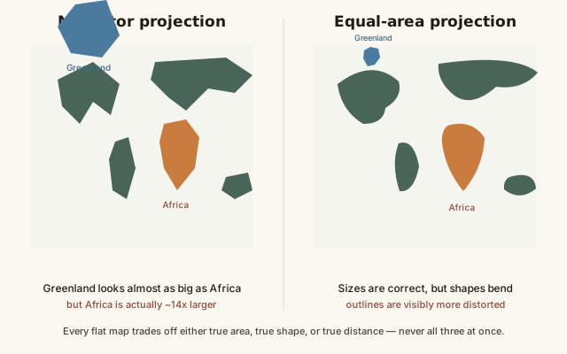
2The Mercator projection, still common in web maps, preserves angles for navigation but wildly exaggerates the size of landmasses far from the equator — Greenland looks roughly the size of Africa despite being about 14 times smaller.
3Map scale is a ratio: 1:100,000 means 1 unit on the map equals 100,000 of that same unit in reality, and a smaller scale number (1:10,000) actually means a more zoomed-in, more detailed map, not a bigger area.
The concept
A map projection is the method mapmakers use to turn the round Earth into a flat map you can print or scroll through on a screen. Because Earth is a sphere and paper is flat, something always has to give — you can't peel an orange and lay the peel perfectly flat without stretching or tearing it, and the same is true of a map. Different projections choose to sacrifice different things: some keep shapes looking right but distort size, some keep size accurate but distort shape.
That unavoidable tradeoff explains why the exact same continent can look like two different sizes on two different maps — and nowhere is the effect more famous, or more consequential, than with Mercator and Greenland.
Quick check
On a standard Mercator world map, Greenland appears roughly the same size as Africa. In reality, how do they compare?
Worked examples
Example 1: Reading a map scale ratio (baseline case)
A hiking map is labeled 1:50,000. That means every 1cm measured on the map equals 50,000cm — or 500 meters — in the real world. If a trail measures 8cm on the map, the real trail is 8 × 500 = 4,000 meters, or 4km. This is why map scale ratios are so useful: they turn a ruler measurement directly into a real-world distance, with no separate conversion chart needed, as long as you remember the units the ratio is expressed in.
Example 2: Why 'large scale' means more zoomed in, not more area (edge case / variation)
A city street map at 1:5,000 is called a large-scale map; a world atlas page at 1:50,000,000 is a small-scale map — which feels backwards the first time you hear it, since the street map covers a tiny area and the atlas page covers the whole planet. The terminology refers to the scale fraction itself: 1/5,000 is a mathematically larger number than 1/50,000,000, even though the map it describes covers a smaller area in far more detail. Once you anchor to the fraction, not the geography, the naming stops being confusing.
Quick check
Which of these is a 'large-scale' map in the cartographic sense?
Example 3: Why web maps default to Mercator despite the distortion (real-world / applied case)
Google Maps and most other web mapping platforms use a variant of the Mercator projection (specifically "Web Mercator"), not because it's the most accurate representation of area, but because it preserves local shape and angle at any zoom level, which makes street-level navigation and direction-following intuitive, and because it lets the whole world be rendered as square tiles that are computationally simple to zoom and pan. The tradeoff is well known and generally accepted for navigation use, but the same projection has drawn real criticism when used for general reference or educational world maps, since it visually inflates the importance and size of countries far from the equator (mostly wealthier nations in North America and Europe) relative to those near it.
How it works (visual)
Mercator vs. equal-area projection: the same landmasses, two different tradeoffs
Both maps are mathematically valid and neither is simply "wrong" — they trade the same underlying distortion for two completely different purposes, angle-preservation for navigation versus area-accuracy for size comparison, and choosing between them depends entirely on what the map is being used for.
Common mistakes
Common Mistakes
✕
Assuming a map projection is just an art style choice with no real tradeoff.
→ Remember every projection sacrifices at least one of shape, area, distance, or direction — there's no neutral or 'undistorted' flat map of a sphere.
✕
Reading 'large scale' as meaning 'covers a large area.'
→ Flip the association: large scale means a large scale fraction, which means more zoomed in and more detailed, covering a smaller area — not the other way around.
✕
Comparing countries' relative size directly from a Mercator map.
→ Check an equal-area projection (or the actual km² figures) before drawing size conclusions — Mercator systematically inflates landmasses at high latitudes.
Common misconception
“The Mercator projection shows the true relative size of the world's countries and continents.”
The Mercator projection was designed to preserve angles for navigation, not to preserve area — and it distorts area severely at high latitudes. Greenland (about 2.16 million km²) appears roughly the same size as Africa (about 30.4 million km²) on a standard Mercator map, despite being about 14 times smaller in reality. Alaska, Canada, and Russia all appear substantially larger relative to equatorial countries than their true land area justifies. For accurate size comparisons, an equal-area projection or the actual km² figures are needed — Mercator was never built for that job.
Quick check
A student compares two countries' sizes by eye on a standard Mercator world map and concludes Country A (near the poles) is much bigger than Country B (near the equator). What's the risk in that conclusion?
Try it yourself
Convert a map distance to real-world distance using scale
Real-world distance (km)4
What to do next
What to do next
Try the calculator above with your own map's scale ratio and a measured trail or route distance to get a real-world distance instantly.
Next time you look at a world map online, check which projection it's using (most web maps note this, or it's Web Mercator by default) before comparing country sizes by eye.
Search for an equal-area world map and compare Greenland to Africa directly — the size difference is dramatic once distortion is removed.
Read the related entry on Latitude & Longitude Explained to see how the coordinate grid itself interacts with projection distortion.
FAQ
FAQ
Related terms
Related terms
Map projection
A mathematical method for representing the curved surface of a sphere (like Earth) on a flat plane, always introducing some form of distortion.
Mercator projection
A widely used map projection, created in 1569, that preserves angles and shape locally but severely distorts the size of landmasses far from the equator.
Equal-area projection
A map projection that preserves the true relative area of landmasses at the cost of distorting their shape, such as the Gall-Peters or Mollweide projections.
Map scale
The ratio between a distance measured on a map and the corresponding real-world distance, typically expressed as a ratio like 1:100,000.
Large-scale map
A map with a small scale denominator (e.g. 1:10,000) showing a smaller area in greater detail — counterintuitively, 'large scale' means more zoomed in, not more area covered.
Small-scale map
A map with a large scale denominator (e.g. 1:10,000,000) showing a larger area in less detail — 'small scale' means more zoomed out.
 KnowThis