 KnowThis
Key Takeaways
Key Takeaways
- 1Greenland looks about the same size as Africa on most world maps, but Africa's real land area is roughly 14 times larger — a direct artifact of the Mercator projection's distortion near the poles.
- 2The Great Wall of China is not visible to the naked eye from low Earth orbit, despite its enormous length, because it's only a few meters wide — astronauts have confirmed this directly.
- 3Water draining from a sink or toilet doesn't reliably spin in different directions by hemisphere — the Coriolis effect is real at storm scale but far too weak to consistently control drainage at the scale of household plumbing.
The concept
The Greenland-versus-Africa comparison is the single clearest, most measurable example of a map-projection myth in action, and it's worth working through with the actual area numbers before moving to the physics- and history-based myths.
On a standard Mercator world map, Greenland appears roughly the same size as Africa. What does this actually tell you about their real land areas?
Worked examples
Example 1: The Great Wall of China "visible from space" myth (baseline case)
Example 2: The bathtub-drain Coriolis myth (edge case / variation)
The Coriolis effect genuinely makes hurricanes spin in consistent directions by hemisphere. Does it also reliably make bathtub and toilet water drain in opposite directions by hemisphere?
Example 3: Why Greenland looks so much bigger than it is (real-world / applied case)
Greenland's real land area is approximately 2.17 million square kilometers. Africa's real land area is approximately 30.37 million square kilometers — meaning Africa is roughly 14 times larger than Greenland in reality, while a standard Mercator map makes them appear close to equal in size. This happens because the Mercator projection stretches east-west distances by a factor that grows the closer you get to the poles, and to keep the map's shapes locally correct (angles undistorted), it has to stretch north-south distances by a matching amount at each latitude — the combined effect inflates area by roughly the square of that stretching factor. Greenland, sitting mostly between 60°N and 83°N, gets inflated dramatically; Africa, straddling the equator where the projection is nearly undistorted, gets shown close to its true size. The same effect makes Alaska look larger than Mexico (Mexico's real area is actually larger) and makes Russia's already-enormous true size look even more exaggerated than it really is.
How it works (visual)
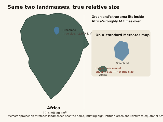
The visual gap between the two panels is the entire myth in one image: the Mercator inset (top-right) is what most people grew up seeing on classroom wall maps, while the true-size comparison (main image) reflects actual measured land area. Neither panel is "wrong" in a technical sense — the Mercator projection is mathematically doing exactly what it was designed to do (preserve navigation bearings) — but only the true-size comparison should be used to judge how big a country or landmass actually is.
Common mistakes
Common Mistakes
Using a standard Mercator world map to judge or compare countries' true relative sizes.
→ Use a true-size comparison tool or an equal-area projection (like Gall-Peters) instead — Mercator is optimized for preserving navigation angles, not area, and severely distorts size at high latitudes.
Assuming 'visible from space' means visible to the unaided human eye from any spacecraft altitude.
→ Check what altitude and optical aid are actually implied — many famous 'visible from space' claims (like the Great Wall) only hold up with a telephoto lens or specific lighting, not the naked eye from normal orbital altitude.
Treating any large-scale physical effect (like the Coriolis effect) as if it applies unchanged at every smaller scale.
→ Check whether the claimed effect's strength actually scales down consistently — Coriolis genuinely governs hurricanes but is overwhelmed by other forces at bathtub scale.
Common misconception
“Greenland is roughly the same size as Africa, because that's how they appear on most world maps.”
This is one of the most persistent and measurable geography myths, and it's purely a side effect of the Mercator projection, first created in 1569 for sea navigation. Greenland's actual land area is about 2.17 million square kilometers. Africa's actual land area is about 30.37 million square kilometers — roughly 14 times larger than Greenland, not remotely equal. The Mercator projection preserves compass bearings as straight lines (extremely useful for sailors), but to do that mathematically, it has to stretch landmasses more and more the farther they sit from the equator, inflating area by roughly the square of that stretching factor. Greenland sits almost entirely between 60°N and 83°N, deep in the zone of heavy distortion; Africa straddles the equator, where the projection is nearly undistorted. The map isn't lying about shape or navigation bearings — it was never designed to represent size accurately in the first place, and treating it as if it does is the actual error.
Why does Greenland look approximately the same size as Africa on a standard Mercator map, even though Africa's real land area is about 14 times larger?
Try it yourself
What to do next
What to do next
- Try the calculator above at Greenland's approximate latitude (around 72°N) versus Africa's (around 5°N) to see how sharply the distortion factor changes.
- Next time you see a Mercator-style world map, mentally flag high-latitude countries (Greenland, Canada, Russia) as visually oversized relative to equatorial ones.
- Look up a true-size comparison tool online and drag Greenland or Alaska down over the equator to see their real relative size.
- Read the related entry on Geographic Records for more genuinely verified extreme-point facts to contrast against common myths.